I believe that strategy and branding can change not only a company's image, but also its very way of thinking – making a business more conscious, stronger, and more connected to people. Alexander Magidson, founder of Brand Brothers

Auchan – private label relaunch
When Auchan hypermarket customers saw chocolate bars with a simple black design and a golden bird on the shelves in April, it became clear the chain had begun a new phase of private label development. This work was part of a global transformation of Auchan's marketing strategy in Russia, and Brand Brothers was entrusted with creating a new concept and packaging system for its wide range of private label products.
Дизайн упаковки, Создание бренд-бука, �Редизайн, Ребрендинг, СТМ, Фуд-съёмка
2018
CONTEXT. Russian private labels emerged in 2003, emulating the Western "first price" model: minimal design, maximum savings. The "Every Day" brand (well-remembered) with its deliberately simple design became a symbol of a great deal. But the market changed – the convenience store format became the standard. Weekly shopping became rare. Competitors launched their own first price lines, and shoppers became more attentive to quality and aesthetics. Low price ceased to be a decisive factor in choosing, while the mid- and high-end segments grew rapidly. This new reality required a rethinking of the private label strategy and a revamp of the entire visual communications system.
CHALLENGE. To create a coherent, modern, and structured private label packaging system, where each product category has its own price positioning, a unified design code, and a recognizable visual marker. The key idea was to leverage the Auchan brand's core asset: the bird, a long-standing symbol of trust worldwide. We focused on creating a system that:
– has a clear price segment architecture;
– enhances trust in the chain's brand;
– makes the product range easy to navigate;
– reflects Auchan's new strategy;
– utilizes the brand's main symbol – the bird.
SOLUTION. New private label architecture – we developed a system that makes the product range clear, user-friendly, and visually cohesive. Each price category received its own graphic level:
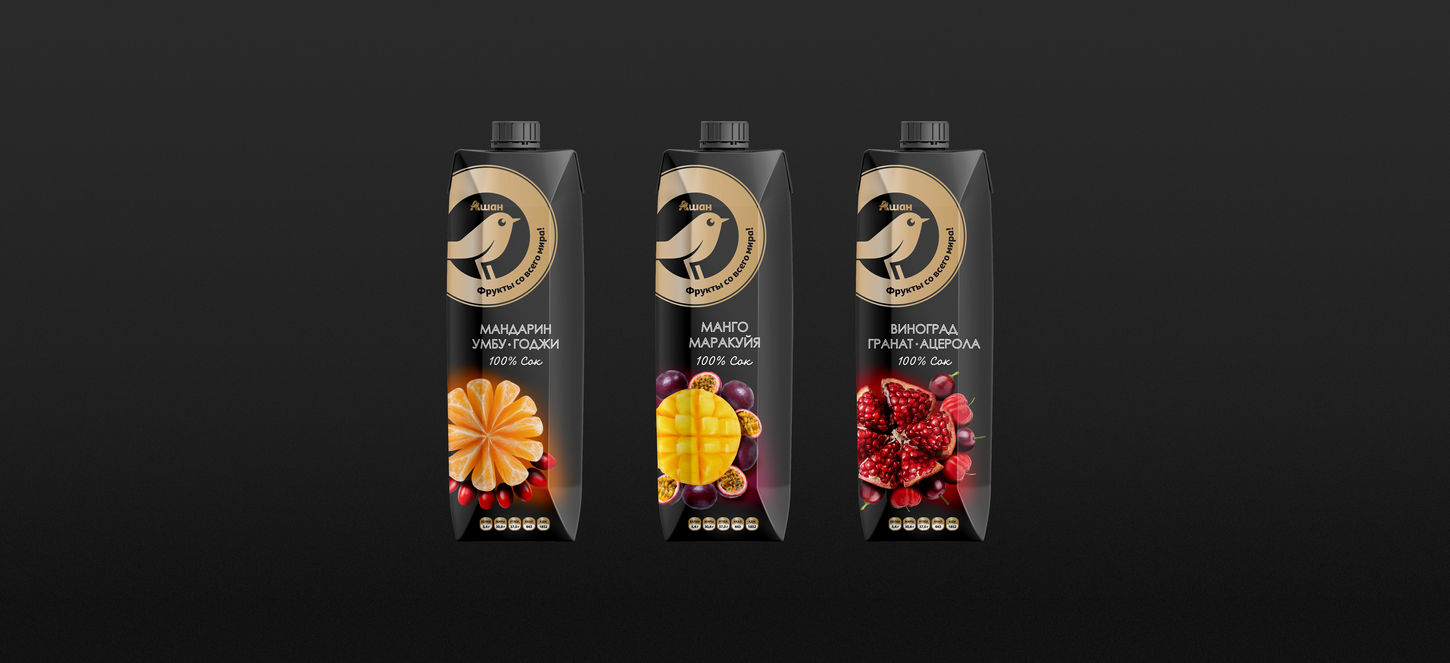
– Premium – a golden bird on a black background. These products launched the relaunch: minimalism, expressive contrast, and a haute cuisine feel.
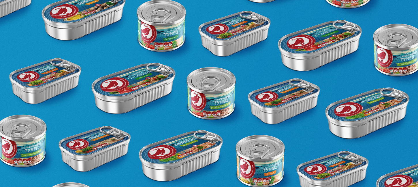
– Mid-range – a red bird. The signature corporate color became the foundation of a universal line for everyday shopping.
– First price – a green bird. An honest, simple design that signals affordability while still looking neat and modern.
The new packaging system has elevated private labels to a level where they can successfully compete with brand-name manufacturers.
DESIGN CONCEPT. We paid special attention to the product style. We photographed some of the new product range to highlight the quality of the ingredients and create an emotional atmosphere around the product. The key question we posed was:
What feeling does a customer get when they hold a product at home or see it for the first time in a store? Now, packaging communicates not only price but also taste, pleasure, and quality – what is important to the modern consumer. The relaunch is part of Auchan's larger strategy. The changes to the private label were just the tip of the iceberg. At the same time, the chain tested a new store format:
– Redesign of the retail space;
– Updated navigation, display, and lighting;
– Increased focus on fresh products;
– Master checkout areas and contactless payment service;
– Redesigned product matrix.
The store atmosphere has become more in line with European markets: comfort, naturalness, visual clarity, and an emphasis on quality.
RESULTS The new visual system has received market recognition. The launch of the updated private label system became an important part of the strategic change at Auchan's Private Label Department and began a transformation in the perception of private labels in Russia. Just a year later, the updated Auchan Private Label, for which we developed a development system, rules for working with design categories, and product composition, and helped launch the first wave of rebranding, received Private Label Awards 2019 in two key categories:
– Best Private Label in the Premium Segment – "Golden Bird" (the "Cereals of the World" line).
– Best Private Label in Food Products – "Red Bird" (the "Frozen Berries" line).
– Red Bird ice cream also received first place for best packaging design.
These awards confirmed that the new strategy, design navigation, and visual language of the relaunch were fully justified.
CONCLUSION We helped Auchan create a private label system that:
– enhances trust in the chain's brand
– facilitates product navigation
– reflects the shift from price competition to customer experience
– becomes a full-fledged part of Auchan's larger transformation in Russia
The new visual strategy became the starting point for updating the chain's entire communications – from packaging to the in-store environment.


