I believe that strategy and branding can change not only a company's image, but also its very way of thinking – making a business more conscious, stronger, and more connected to people. Alexander Magidson, founder of Brand Brothers

Eqis – Institute of Advanced Urology
The Eqis Institute of Advanced Urology was created as a new brand in the medical field, where patient quality of life and comfort are at the core of the entire strategy. We conducted in-depth research, developed a conceptual platform, and created an identity.
Исследования, Аналитика, Стратегия, Позиционирование, Бренд-платформа, Нейминг, Айдентика, Разработка логотипа
2022
Here is the translation of your case study text into professional English, maintaining the structure and tone suitable for a branding agency portfolio.
CONTEXT. The client was establishing a new private medical institution in Moscow focused on urology, andrology, and men's health. The format was not just a clinic, but an institute combining diagnostics, treatment, technology, and an educational component for both doctors and patients. We were tasked with building a brand that fundamentally changes the attitude toward urology:
To move away from medical stigma, anxiety, and "closed" formats;
To create the feeling of an expert institute that is simultaneously modern, human, and technological;
To develop a name, visual language, corporate identity, and interior design that translate a new philosophy of medicine—clarity, respect for the individual, a high culture of communication, and an evidence-based approach.
We conducted comprehensive research, formulated the brand strategy, and developed the naming, identity, and visual architecture of the space.
At the start of the project, we focused on understanding the real patient experience—not the clinical one, but the human one. In-depth interviews confirmed a key problem: most men visit a urologist only when the fear for their life outweighs the fear of the procedures. In the early stages, patients ignore symptoms, fear painful procedures, distrust diagnoses, while medical bureaucracy and embarrassment only reinforce the barrier. We obtained an additional layer of data after analyzing international and Russian clinics: the market is developing rapidly technologically, yet almost no one addresses the emotional and communication barriers of patients. Most institutions talk about "treating diseases," but almost no one talks about preserving quality of life, intimacy, one's own form of masculinity, and confidence. We also studied the technological context. Organ-sparing techniques, such as HIFU, drastically reduce the invasiveness of treatment, eliminate many typical side effects, and give the patient what is missing—control over the situation and predictability of the result. However, this potential is not reflected in the communications of most clinics. This led us to the project's key insight: the patient needs not just a "treating physician," but a system that gently restores a sense of equilibrium: physical, emotional, and vital.
BIG IDEA. The foundation of the development was the main patient insight: when health is under threat, a person loses the sense of control and balance. Fear of procedures, medical bureaucracy, anxiety about preserving functions, and the intimate nature of the problem—all this forms a powerful barrier to seeking medical help. We realized: the clinic needs not "medical" communication, but human-centric communication that restores the patient's confidence, calm, and sense of support. Thus, the brand idea was born: EQUILIBRIUM—balance that returns along with health. This idea became the foundation of the entire EQIS strategy:
A balance of high Western technologies and Russian expertise;
A balance of precision and a human attitude;
A balance of treatment efficiency and preservation of quality of life.
The positioning is reflected in the statement: "An Institute of Advanced Urology with organ-sparing technologies and Russian expertise for preserving a dignified, full life."
NAMING. The name Eqis was born from the brand idea—Equilibrium—around which the entire meaning of the Institute is built. We sought a word that reflects neither illness nor treatment, but the state every patient strives for: calm, control, confidence, and a return to one's own norm. Eqis is a shortened form of Equilibrium. This name combines scientific precision, technological advancement, and emotional depth. It sounds modern, international, and is easily scalable—from medical products and research to educational programs and clinical directions.
IDENTITY. The Eqis logo is built around the fundamental metaphor of the brand—the transition from a state of anxiety to a state of control, health, and calm. The logo is divided into two balanced parts: the left, dark side symbolizes the state before visiting the doctor. This is a space of doubt, fear, unspoken words, and a lack of understanding of what is happening to the body. It is in this zone that people most often find themselves alone with their problem. The right, light side reflects the part of the journey that comes after treatment. Calm, predictability, and a return to quality of life—everything patients hope to regain. Usually, medical identity is overloaded with coldness or impersonality. For Eqis, we chose the opposite path: soft, calm forms, clean typography, and a warm color palette—restrained, professional, and premium, without clichéd "medical" tones, reminiscent more of a five-star hotel.
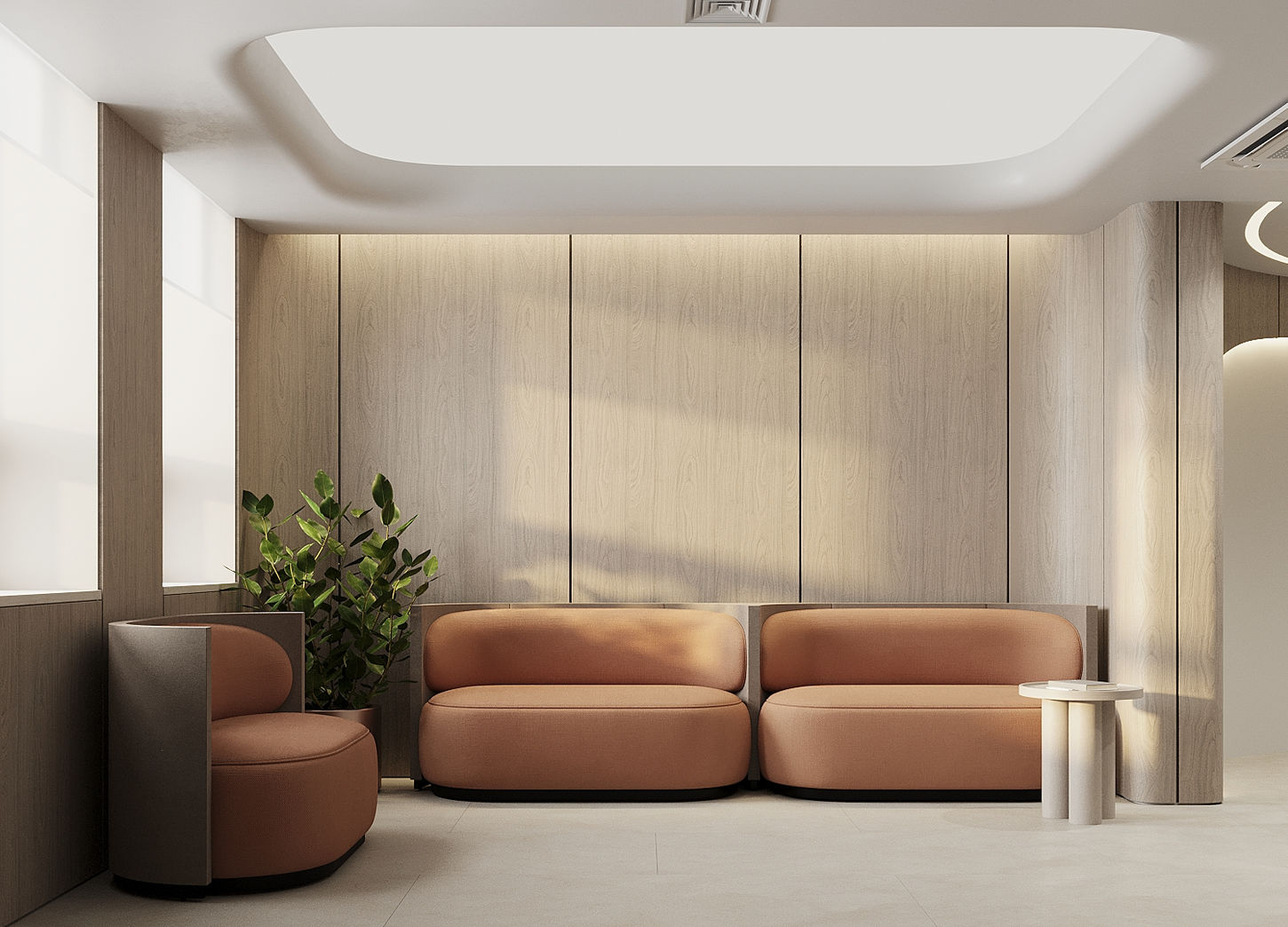
INTERIOR. The Eqis space is built on the same principles as the strategy: the feeling of a five-star hotel rather than a clinic; an architecture of clarity: clean lines, light, order; the absence of anxious stimuli—medical and metal surfaces, tiles, cold tones; tactile materials, wood, soft lighting scenarios; navigation and visual structure that fully reflect the brand identity. The interior is part of the brand. In it, we strive to express the thought: here, everything is created for the person's calm and confidence.


