I believe that strategy and branding can change not only a company's image, but also its very way of thinking – making a business more conscious, stronger, and more connected to people. Alexander Magidson, founder of Brand Brothers

Fenix – rebranding of a systems integrator
Fenix is a leading VIP integrator of RetailCRM, a complex and powerful online commerce management system. Over the past few years, the brand has grown, its project portfolio has expanded significantly, and its expertise has deepened. However, the corporate identity remained the same—created in-house at the start. This led to dissonance: the visual identity didn't reflect the scale, quality of work, or level of technology Fenix brings to its clients.
Разработка логотипа, Разработка фирменного стиля, Создание бренд-бука, Ребрендинг, Айдентика
2022
CHALLENGE. The client approached us with the task of creating a new visual system that would convey the brand's maturity, enhance business trust, and allow Fenix to communicate with the market in a modern, confident manner.
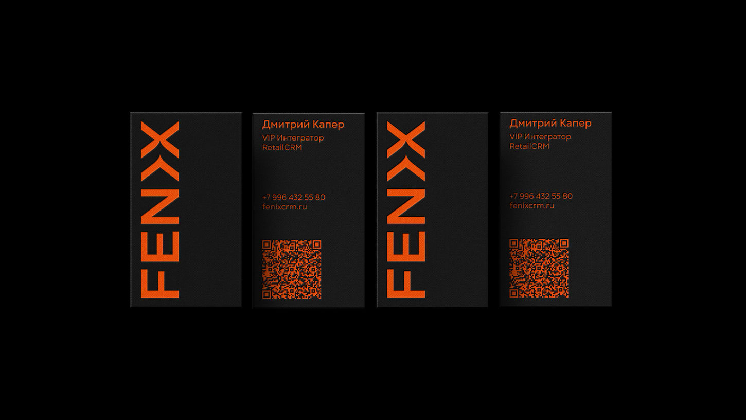
SOLUTION. We retained the company's core symbol—the name itself. The phoenix, as a mythological image, is already embedded in the wordmark, so we deliberately abandoned the literal depiction of the bird in the logo. We wanted to break away from clichés and find our own original metaphor. We began searching for character not in the icon, but in the brand's typography. This is how the stylized grapheme within the word Fenix was born—a carefully integrated silhouette of a burning bird, revealed in the font's form. This solution makes the logo expressive, unique, and integrates the symbolism of transformation directly into the brand's structure. We interpreted the phoenix image not as a legend, but as a metaphor for the constant renewal, process flexibility, and business transformation that clients experience after integrating RetailCRM.
COLOR SCHEME. In our palette, we relied on two key values: orange – the color of fire, energy, and rebirth; an accent that becomes the emotional core of the style; and dark charcoal – the color of confidence and depth, supporting expertise. This combination creates a vibrant yet restrained character and easily scales to any medium: from presentations and landing pages to interfaces and team branded materials.
RESULT: We created a visual system that reflects Fenix's maturity and enhances brand trust in a segment where expertise, speed, and precision are essential. The identity has become more structured, flexible, and modern – the company now looks as convincing as it operates.


