I believe that strategy and branding can change not only a company's image, but also its very way of thinking – making a business more conscious, stronger, and more connected to people. Alexander Magidson, founder of Brand Brothers

PhosAgro Updates Its Visual Identity
PhosAgro is a global leader in mineral fertilizer production, supplying products to farmers in more than 100 countries. The company produces dozens of brands of granular and liquid fertilizers, as well as feed additives and micronutrient products.
Дизайн упаковки, Разработка фирменного стиля, Ребрендинг, Дизайн презентации, Создание бренд-бука, Редизайн, Стратегия, Айдентика
2019
CHALLENGE. We needed to unify our entire product range within a single visual logic—from sacks and big bags to transport packaging—while maintaining ease of recognition during production, storage, and logistics across the company's three sites.
DESIGN STRATEGY. We developed a new product architecture that systematically divided product groups by function and purpose:
– Nitrogen-phosphorus fertilizers – Apaviva,
– Feed additives – Apafeed,
– Liquid complex fertilizers – Apaliqua,
– Specialized products with micronutrients – Apaviva+.
The goal was to create a transparent, visually readable structure where each product retains its connection to the PhosAgro brand, but is easily identified by its color and symbolism.
PACKAGING DESIGN AND LABELING SYSTEM
The visual language is based on circles, PhosAgro's signature element. We reimagined this element, transforming it into a color-coding tool: each product line now has its own consistent base color. This approach solves several problems simultaneously: it ensures instant recognition, reduces the risk of shipping errors, and helps customers navigate our product range more quickly. The developed solutions are consolidated into a single brand book, which includes a description of the design principles, graphic and color system, application rules, and scaling for future product lines.
COMMUNICATION DESIGN
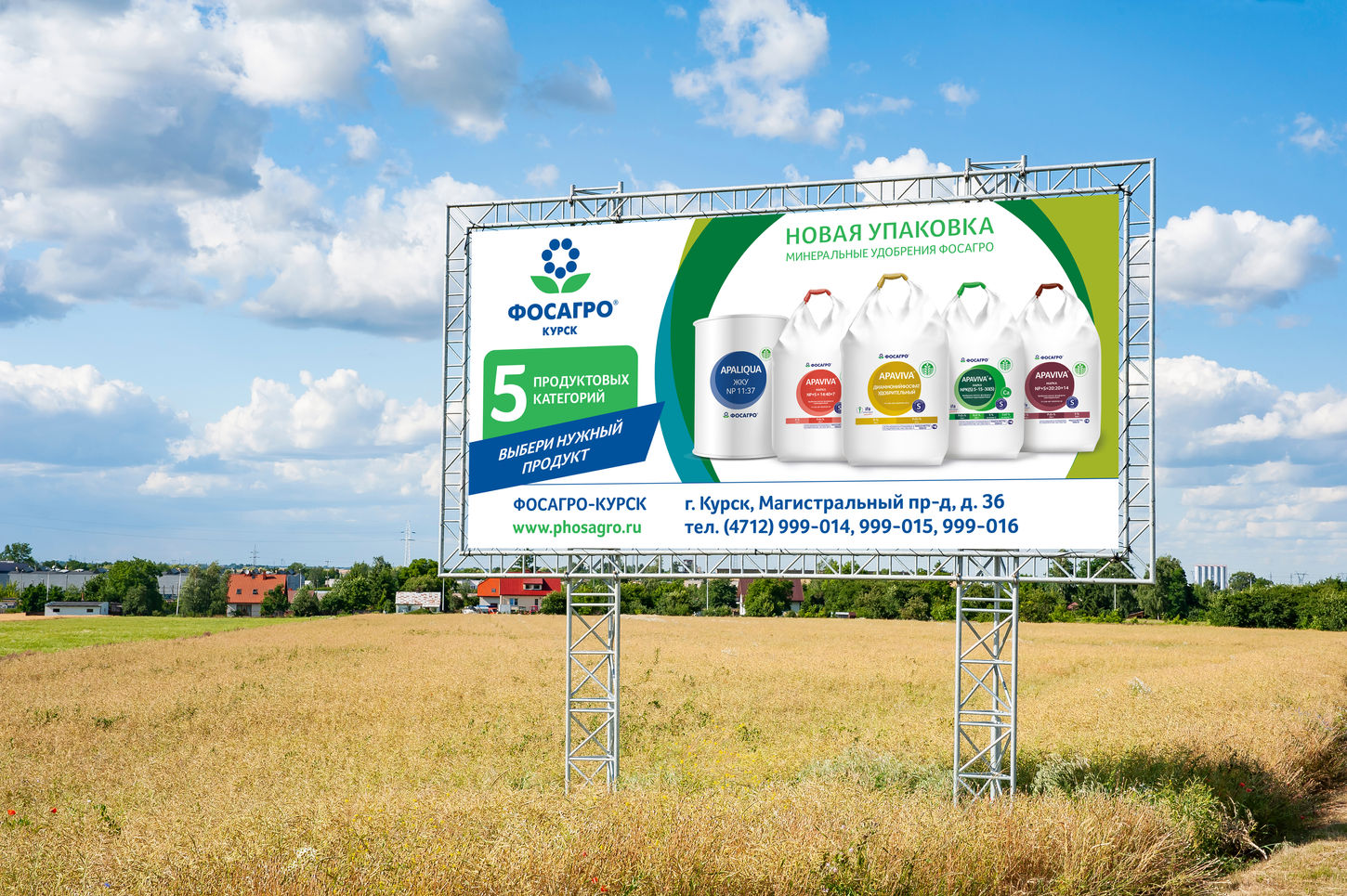
PhosAgro actively participates in international exhibitions and industry events, promoting Russian fertilizers as a benchmark for environmental friendliness and technological advancement. To this end, we created advertising layouts and visual materials—from exhibition stands to outdoor advertising—building a coherent visual ecosystem that supports the image of a global, confident brand with clear visual discipline.
RESULT. A unified visual system was created, uniting over 30 SKUs and improving product assortment management. Thanks to the new color-coding system, the company's employees and partners can more quickly navigate the product range, and the PhosAgro brand is now perceived in the market as a technologically advanced, modern, and visually unified industry leader.


