I believe that strategy and branding can change not only a company's image, but also its very way of thinking – making a business more conscious, stronger, and more connected to people. Alexander Magidson, founder of Brand Brothers

Gravita – a new brand of porcelain tiles
Don-Keram, a leader in the Russian porcelain stoneware market, approached us with the task of creating a new brand of finishing materials. The goal was to expand the product range, strengthen its position in the premium segment, and establish a communication strategy that would be understandable to both the end customer and the professional community: architects, designers, and builders. It was important to create a brand that expresses not just the aesthetics of the materials, but a philosophy of life reflected in the space.
Бренд-платформа, Позиционирование, Нейминг, Разработка логотипа, Разработка фирменного стиля, Создание бренд-бука, Дизайн презентации, Исследования, Стратегия, Айдентика
2022
RESEARCH AND ANALYTICS. When a familiar market collapses, branding becomes a matter of survival. We faced the task of developing a new brand for a company that had supplied Spanish tiles and porcelain stoneware to the Russian market for decades. But in 2022, everything changed. The team faced a simple yet fateful task: not to shut down. In the search for new production sites, the choice fell on India—a country with hundreds of factories and huge potential, yet minimal predictability. Products can be found, but the quality and design are identical across the board. To avoid drowning in this sea of sameness, we needed to differentiate. That is when the idea of a private label was born.
We started with market and audience research. We discovered that modern buyers in the finishing materials category choose not just tiles, but the environment in which they want to live. They value a sense of comfort, style, and individuality. Thus, the Lifecentric concept emerged—a philosophy centered on the person and their vision of life. The company does not manufacture tiles itself. Instead, it curates quality and style, selecting the best factories, controlling every stage, and choosing collections through the eyes of the consumer. We focused on ensuring the new brand was perceived not as a supplier, but as a lifestyle curator—a brand that helps create a space filled with meaning.
BRAND PLATFORM. The essence of the strategy is simple: Gravita helps create spaces filled with life. This became the semantic core of the communication platform. The brand's visual language is built around ideas of equilibrium, comfort, and harmony. Gravita is not about luxury. It is about balance, taste, and the pleasure of a space where everything is in its place.
NAMING. The brand name Gravita was born from the idea of attraction (gravity). It is the center around which home life revolves. At the same time, the name combines two roots: granite (stone, foundation) and vita (life). It is concise, universal, sounds natural in different languages, and combines durability with living motion.
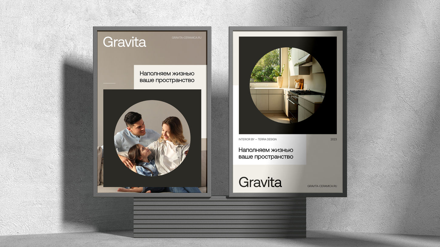
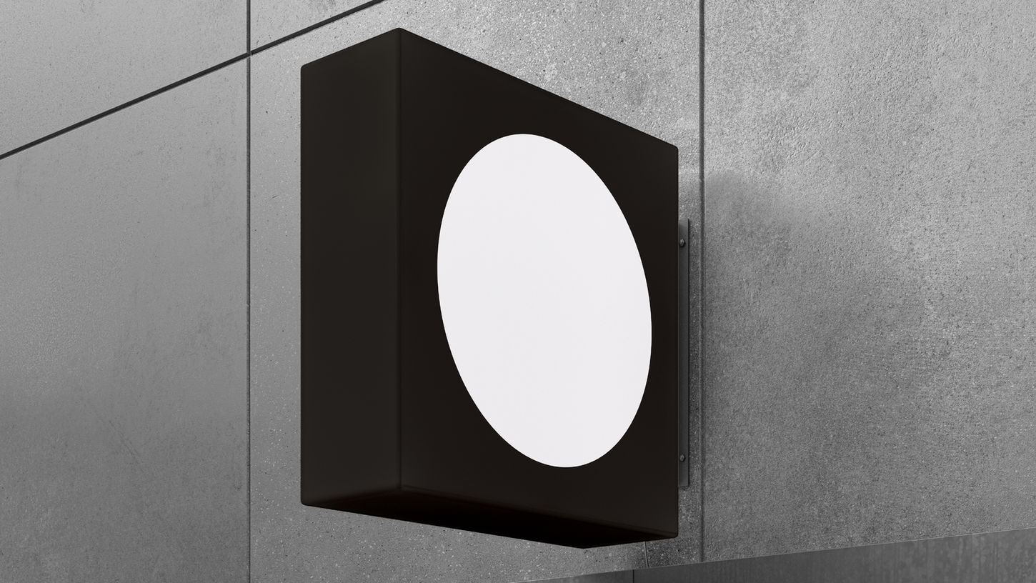
IDENTITY AND COMMUNICATIONS. The Gravita logomark reflects the brand philosophy: a square—a symbol of stability and the form of an ideal space; a circle inside—life, energy, movement. This combination became the brand's recognizable visual code. The mark works as a container—interiors, textures, and fragments of life live within it, emphasizing the idea of "life inside the form." Based on this basic geometry, we created a system of pictograms that highlights the purity and functionality of the visual language. A monochrome palette and concise typography form the feeling of a European brand with history, while the visual solutions are easily scalable—from packaging and catalogs to exhibition stands and digital communications.
IMPLEMENTATION. For the client's team, this was the first experience of creating a brand from scratch. There was anxiety: how would the market perceive it? Would partners understand? But the launch at the MosBuild industry exhibition showed: we hit the mark. The Gravita brand immediately stood out—in style, level of presentation, and atmosphere. An interactive zone appeared at the stand: tiles that could be drawn on with markers. Thus, an idea was born to test the brand's durability through interaction with life. Children drew, parents were amazed: the tiles didn't scratch, didn't stain, and were easily cleaned. Later, a chat spontaneously emerged around this, where partners began sending photos of "masterpieces" by little visitors. This gave birth to live communication: Gravita fills the space with life, even when it’s children's scribbles on the walls. Based on this idea, the brand characters appeared—the "Gravita family": mom, dad, kids, and a dog. They come alive in the brand's interior scenes, helping to connect the product with the real lives of customers. Even the digital dog became a symbol of the future—technologies change, but Gravita tiles remain the same: reliable and eternal.
QUALITY AS A PHILOSOPHY. One of the key elements of success was the quality control system. The company hired an external team—Third Eye from Vietnam—to control Indian production at all stages: from polishing and packaging to container loading. Thanks to this, the defect rate dropped to 0.5% compared to the market average of 2%. Gravita became synonymous with "India of superior quality." In the eyes of partners and consumers, this cemented the brand as reliable and premium.
RESULTS. The launch of Gravita became a turning point. In the first full year, the brand delivered sales growth of 38.6%, and by the middle of the following year—58%. Compared to 2022, volumes have more than doubled. The share of the Gravita brand in the company's total assortment reached 50%, and its penetration into partners' assortments reached 83%. Gravita became an example of how branding can not just decorate a business, but save it, moving the company from a state of crisis to a phase of confident growth.
CONCLUSION. Gravita is a system of meanings, processes, and solutions that helps the company be closer to people. It speaks to professionals in the language of design, and to the end consumer in the language of emotions, comfort, and real life. A brand born of the necessity to survive has become a symbol of stability, taste, and a human approach to space. Gravita—spaces filled with life.


