I believe that strategy and branding can change not only a company's image, but also its very way of thinking – making a business more conscious, stronger, and more connected to people. Alexander Magidson, founder of Brand Brothers


Incarna – personal values in the form of jewelry
The jewelry market is growing slowly and cautiously, but there are segments within it where demand is growing year after year. Buyer behavior is also stagnant: people come to buy jewelry with a clear budget and a clear sense of what they want for that money.
Аналитика, Исследования, Бренд-платформа, Создание бренд-бука, Разработка фирменного стиля, Разработка логотипа, Стратегия, Айдентика
2020
THE CHALLENGE. We faced a complex challenge – developing a new jewelry brand in the mid-to-high-end segment: conducting research, conducting analytics, developing positioning and naming, creating a visual identity and brand book, and preparing trademark registration.
ANALYTICS AND STRATEGY. We began by immersing ourselves in the market and its audience. We researched several dozen players, studied consumer behavior, and interviewed women of varying ages and income levels. The conclusion was clear: the niche of designer jewelry in the mid-to-high-end segment, where not only quality but also uniqueness is valued, offered opportunities. Despite the large number of small workshops and designers, we identified a key opportunity: the market is virtually devoid of players with a strong idea, a clear strategy, and a coherent style. Even niche brands often suffer from poor communication. This became the basis for our chosen direction: we are creating a brand that will occupy a niche of unique, designer jewelry with a strong artistic code and emotional appeal, rather than compete in the "mass classics" category.
POSITIONING. During our research, we noticed that women's jewelry choices are rarely rational. They are always emotional. It's an internal response to value, to history, to the feeling of "this is about me." We built our positioning around this idea. Incarna is a brand inspired by fundamental women's values. These are jewelry pieces that embody inner qualities: freedom, truth, beauty, loyalty, strength, tenderness. The brand's mission is to create a tangible form for the intangible. A unique style, a manifesto, a symbol.
NAMING. We were looking for a word that would be at once light, expressive, and new. A neologism that could be imbued with meaning. This is how the name Incarna was born – derived from the English word "incarnation." The word is open, harmonious in rhythm, memorable, and universal. It became the brand's foundation and the perfect framework for positioning.
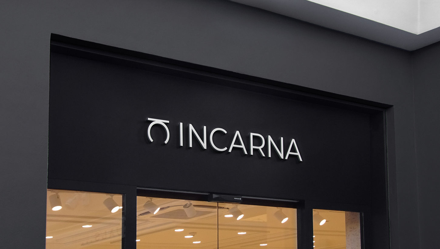
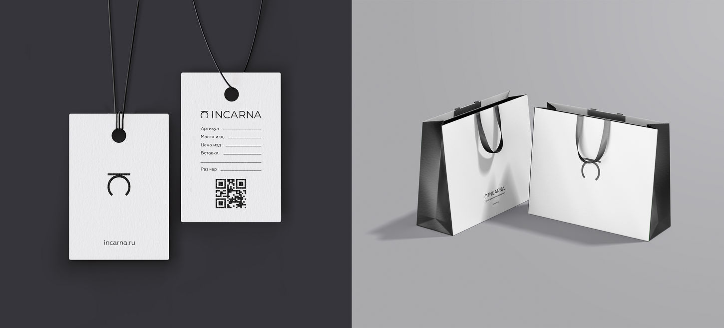
IDENTITY. The brand's visual identity is built on simplicity and symbolism. The Incarna logo is a minimalist symbol, reminiscent of a ring, composed of two letters: I and C. We deliberately moved away from the overly busy style typical of the jewelry market. The identity needed to convey calm confidence, depth, and individuality, rather than compete with the products. The layout was sparse, with an emphasis on airiness and composition. This creates a gallery-like effect, where each piece is not just a product but a story told by the brand through key visuals. We carefully considered the color palette, typography, symbol application system, packaging, marketing materials, and display cases.


