I believe that strategy and branding can change not only a company's image, but also its very way of thinking – making a business more conscious, stronger, and more connected to people. Alexander Magidson, founder of Brand Brothers

Loov – rebranding of a chain of optical stores
We were approached by the Glazko chain of optical stores and frame repair shops. The company began in 2018 as a repair shop and eventually expanded into a full-fledged optical store. Our task wasn't just to update the visuals, but to formulate a new positioning that would reflect the company's growth, its emotions, and its customer communication style.
Бренд-платформа, Позиционирование, Нейминг, Разработка логот�ипа, Разработка фирменного стиля, Создание бренд-бука, Ребрендинг, Стратегия, Айдентика
2022
TASK. Glazko approached us with the task of creating a strategy, name, and identity that would: strengthen the brand's position in the affordable segment, emphasize care and humanity, unite sales, service, and repair into a single philosophy, and imbue the brand with individuality and warmth.
RESEARCH AND POSITIONING. The Russian optical market is mature and saturated, with strong national players. Our client stood out thanks to its genuine service and loyal audience, who come not just to buy, but for attention and care. We interviewed the chain's customers and noticed: customers choose glasses carefully, with passion, and if they break, they first consider repairs rather than replacements. This is how the positioning idea was born: "The Salon of Favorite Glasses" – a place where people don't just buy glasses, but cherish them. The communication slogan continued this idea: "A place to meet your favorite glasses."
NAMING During the strategy phase, we realized that the old name, "Glazko," didn't convey the desired emotion. We proposed taking it a step further—a full-fledged rebranding. During the search, we sought a short, warm, and memorable word. This is how LOOV was born—it sounds similar to the word "love" and visually resembles eyeglass frames. The name fit perfectly with the brand strategy: LOOV is a brand about the love of things that make life better.
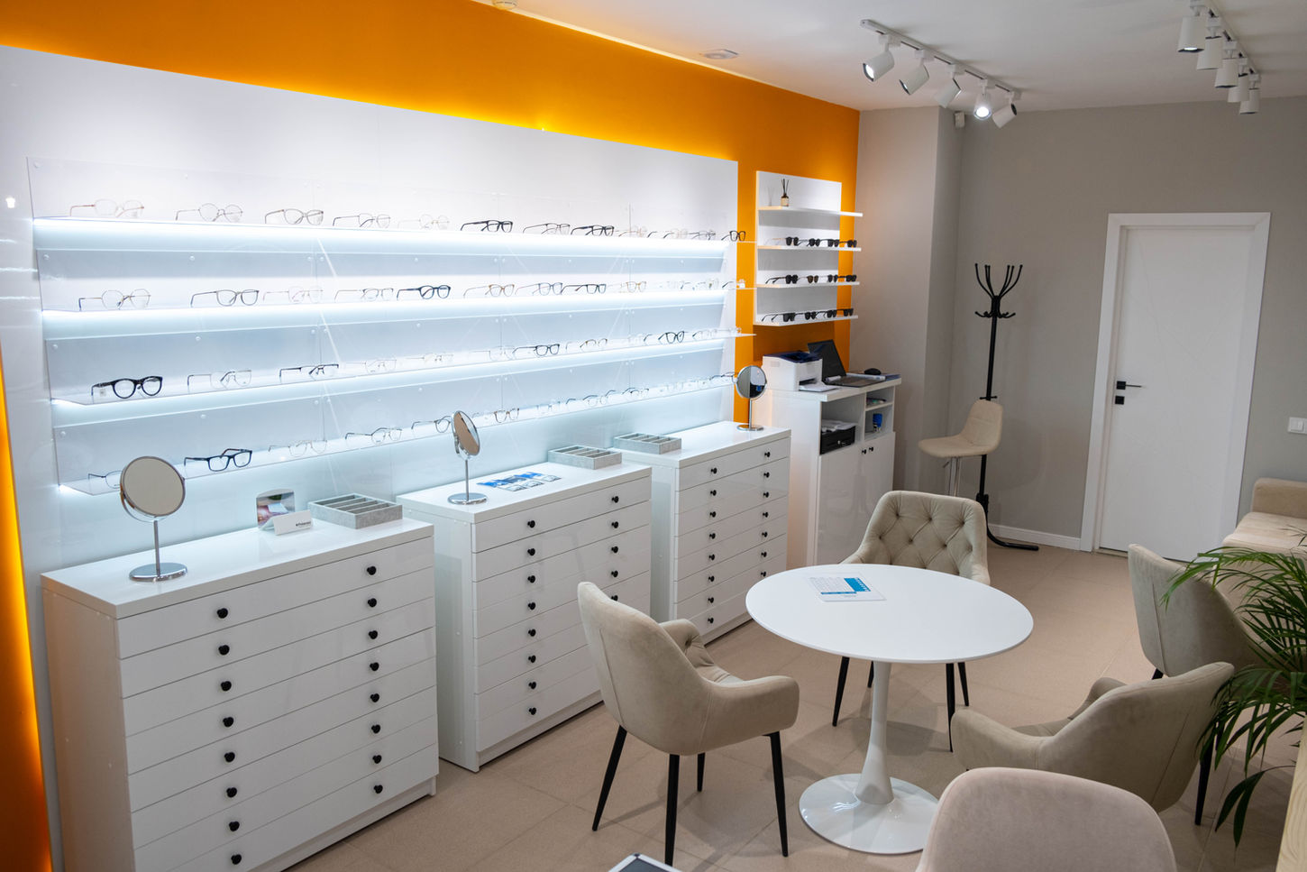
IDENTITY. The core of the corporate identity was a graphic play on the shape of eyeglasses—the letters "OO" in the logo form the frame. This way, the brand visually communicates its essence—love, attention, and simplicity. In the visual system, we used clean flat graphics, orange accents—symbolizing warmth and friendliness, and a defractive texture that adds individuality and a subtle "optical" effect. The identity is democratic, modern, and vibrant, reflecting the character of the brand and the people it serves.
RESULT. The LOOV brand has become a new symbol of attentive service and a human touch. It combines functionality, aesthetics, and care – and speaks to customers in a simple, sincere language.


