I believe that strategy and branding can change not only a company's image, but also its very way of thinking – making a business more conscious, stronger, and more connected to people. Alexander Magidson, founder of Brand Brothers

Method is a brand of investment platform for selective projects
An international team of founders approached us with a request to create a brand for an investment platform that would differentiate itself from typical "fintech startups" and "aggressive investment services."
Аналитика, Исследования, Бренд-платформа, Позиционирование, Нейминг, Разработка логотипа, Разработка фирменного стиля, Стратегия, Айдентика
2024
TASK: We faced a complex challenge: analyze the private investment market and study audience expectations; formulate a positioning and brand platform reflecting our expertise and selective approach; develop a name understandable to an international audience; and create a visual identity that conveys the principle: we select only the best from a multitude of options.
We needed to build a brand that would inspire trust among private investors and emphasize that there are no "mass offers" here, only carefully selected projects.
ANALYTICS AND STRATEGY. We studied the market offerings, audience, and decision-making models. The key insight was that investors don't need "just another marketplace," but a filter, an expert system that helps avoid mistakes and eliminates 29 out of 30 projects. Thus, Big Idea was born: SELECTED INVESTMENT PROJECTS – only the best projects are selected. Based on the research, a brand platform was formed: the essence, values, archetype, mission, and structure of the brand. At the core is the idea of method, analysis, and independent expertise.
NAMING. We developed the name Method – laconic, international, and immediately conveying our approach: investing not by chance, but by method.
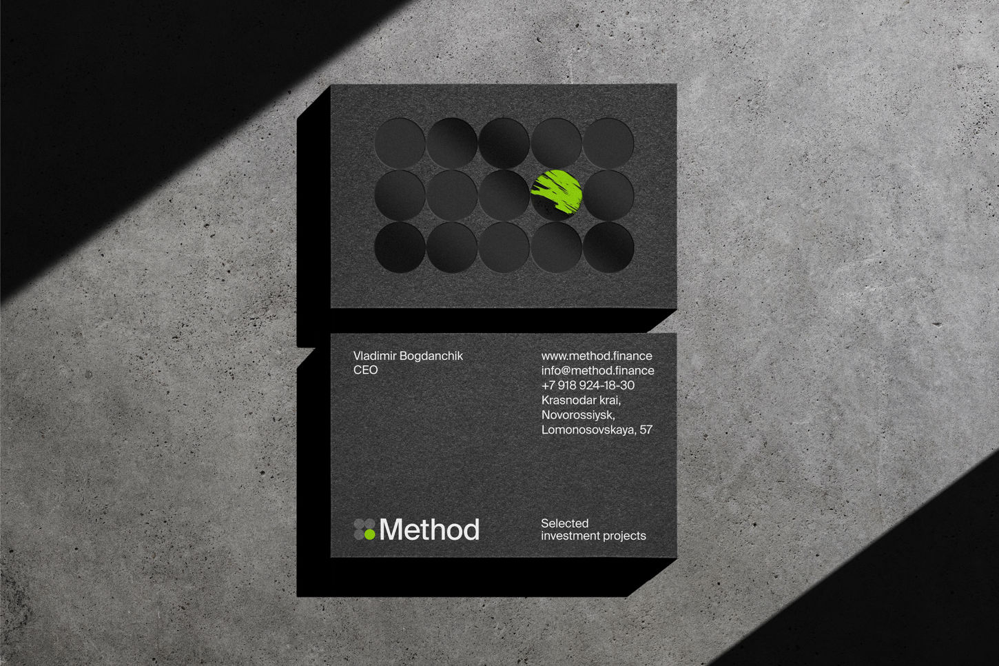
IDENTITY. The idea of selectivity formed the basis of the visual system. The logo is a grid of circles, where one element stands out, symbolizing the one and only project that has passed Method's vetting process. Supergraphics enhance the principle of selection: one striking solution from many.
The corporate color – a bright neon green – became a marker of choice, an accent that instantly attracts attention.
RESULTS. The brand received a clear positioning that distinguishes it in its category: not a marketplace, but an expert filter for investment opportunities. An elegant, minimalist identity with the idea of selection became the foundation of Method's recognition. The name and visual system are easily scalable to new products and international markets. Method has established itself as a reliable, systematic, and modern partner for private investors—a brand that focuses on quality, not quantity.


