I believe that strategy and branding can change not only a company's image, but also its very way of thinking – making a business more conscious, stronger, and more connected to people. Alexander Magidson, founder of Brand Brothers

Healthy Morning – packaging redesign
When the Velle brand decided to enter the more affordable plant-based milk segment, it was important to create a product that would remain "healthy" but would speak to the mass market in a simpler and more understandable way. Our goal was a tactical design that would be easily understood in a split second and perform reliably on the shelf.
Дизайн упаковки, Редизайн
2023
CONTEXT. Velle is one of the pioneers of plant-based beverages in Russia, with a clear reputation as a "healthy, natural, and modern product." However, the plant-based milk market was rapidly changing:
– the healthy eating trend became widespread,
– major players were lowering prices and releasing budget-friendly lines,
– consumers began looking for "healthy at an affordable price,"
– the share of private labels was growing, increasing competition.
To maintain a presence in the category and strengthen mass distribution, the company decided to launch a new line in the low-price segment under a separate brand, "Healthy Morning."
TASK. Develop a packaging design that clearly and simply communicates health benefits, looks fresh and accessible, and expands the audience without competing with Velle's core product line.
APPROACH. For budget-friendly products, packaging is the primary selection tool. We focused on three principles:
1) Clean and simple visual imagery. So that consumers perceive the product as healthy, natural, and easy to consume daily.
2) Presenting benefits as transparently as possible. In the mass market, consumers primarily look for: "plant-based," "lactose-free," "low calorie," and "natural ingredients."
We made these messages first in the visual hierarchy.
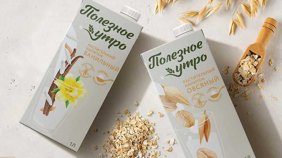
3) Clear flavor identification. The line includes two SKUs: Oat Drink and Oat Drink with Vanilla. Color navigation, large ingredient elements, and a neat product composition help consumers recognize the flavors in just a second.
PACKAGING DESIGN. In the "Healthy Morning" design, we emphasized the lightness, purity, and transparency of the product. This is the mass market segment of plant-based drinks, where consumers primarily seek health benefits and clarity. The visual composition is built around a glass with ingredients—oats or vanilla—that are literally "immersed" in the drink. This approach creates a sense of freshness and naturalness, presenting the drink as is, without complications or visual noise. We used a light pastel palette to give the packaging a fresh and honest look, standing out in the crowded plant-based milk market, where decorative or overly saturated designs often dominate. The logo features a soft, handwritten font, evoking a sense of homeliness and morning calm. Additionally, we presented key benefits ("natural ingredients," "contains sea salt") as neat pictograms—this helps users quickly understand the product's value right from the shelf. The resulting packaging appears lightweight, healthy, and accessible, reinforcing the brand's tactical objective—to establish a strong position in the low-price segment and communicate with consumers using the clear visual language of a "simple, healthy product."

