I believe that strategy and branding can change not only a company's image, but also its very way of thinking – making a business more conscious, stronger, and more connected to people. Alexander Magidson, founder of Brand Brothers

Promtekhaero – visual style update
The Russian Scientific and Technical Center "Promtekhaero" is part of the Almaz-Antey Concern. Its focus is engineering development and research in the field of electronic systems and airspace control.
Разработка логотипа, Разработка фирменного стиля, Создание бренд-бука, Дизайн упаковки, Ребрендинг, Айдентика
2021
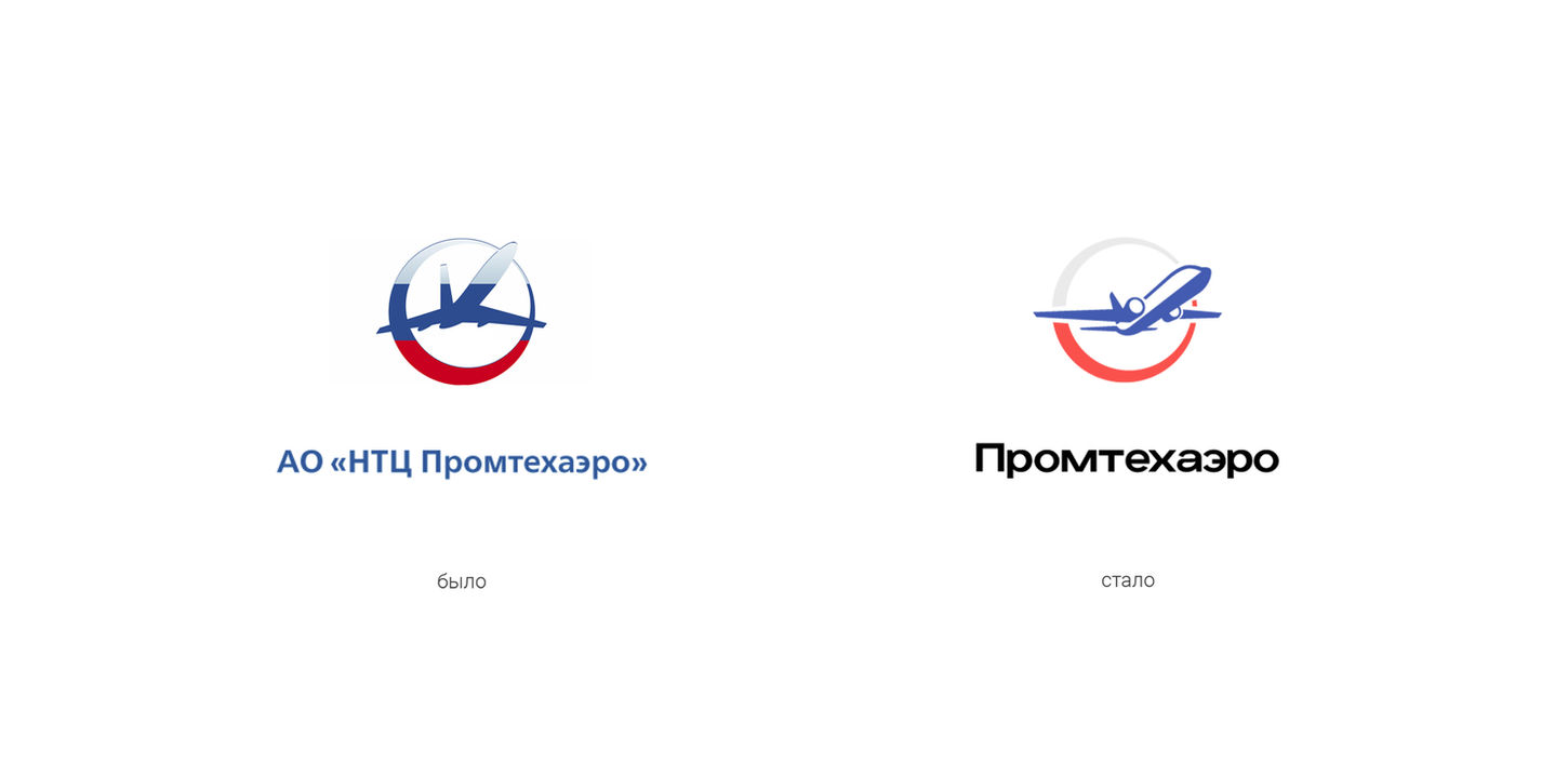
CHALLENGE. We were tasked with modernizing the company's visual identity while maintaining the continuity of the logo and color scheme, while developing additional visual elements for external communications. It was important to make the identity more modern, lightweight, and functional, without losing its corporate rigor and historical identity.
IDENTITY. The updated logo is based on the Russian Sukhoi Superjet transport aircraft. We redesigned the logo's graphics and color scheme, preserving the idea of using the colors of the Russian tricolor. Additionally, we created a system of graphic elements (supergraphics) that can be used both with and without the logo. This approach strengthens the company's visual identity without requiring the logo to be used on every medium. The abbreviation in the logo's style was removed, making it lighter and less formal, and all official designations have been transferred to business documentation.
DESIGN SYSTEM We developed a set of guidelines for logo use in conjunction with the Almaz-Antey logo, including relative positioning and scaling in business documentation and marketing materials. The supergraphics are adaptive and can be used on any media, from equipment packaging to presentation materials, maintaining the brand's consistent visual language.
RESULT. The client received a modern, functional, and flexible corporate identity. We also managed to maintain continuity and historical identity. A foundation has been created for the further development of visual communications and integration into new marketing materials.


