I believe that strategy and branding can change not only a company's image, but also its very way of thinking – making a business more conscious, stronger, and more connected to people. Alexander Magidson, founder of Brand Brothers

Siberiada – a Siberian restaurant in Barcelona
A team of Russian entrepreneurs who had relocated to Spain decided to open a restaurant in Barcelona. Drawing on their successful experience in the restaurant business in Russia, they approached us with the task of testing their business hypothesis and developing the positioning, concept, name, and identity for the new establishment.
Бренд-платформа, Позиционирование, Нейминг, Разработка логотипа, Разработка фирменного стиля, Создание бренд-бука, Стратегия, Айдентика
2021
OBJECTIVE. The client came to us with the task of creating a restaurant brand that would be relatable and appealing to a Spanish audience, stand out in the crowded tapas bar market, tell an authentic story of the founders, and unite cuisine, atmosphere, and visual identity into a unified concept.
RESEARCH AND ANALYTICS. Initially, the project idea revolved around a traditional tapas bar. However, after researching the restaurant market and conducting a series of in-depth interviews with Barcelona residents, it became clear: locals choose trusted places where they know the owners and value history, atmosphere, and personal touch. It would have been difficult for Russian expats to gain trust with such a format. So, we decided to turn to the real story of the founders – a team originally from Siberia.
POSITIONING. Research showed that in the eyes of the Spanish, Siberia is perceived as a distinct, mystical region – not just a part of Russia, but a distant, snowy land with a special spirit and nature. Thus was born the idea of a restaurant and bar with a Siberian soul, in a modern format free of stereotypes. A place to spend an evening with friends, stay for a cocktail, and discover the mysterious Siberia through taste, atmosphere, and emotion. Positioning: Siberian Blend – a modern restaurant with a Siberian character and a cocktail soul.
NAMING. We borrowed the name Siberiada from Andrei Konchalovsky's famous film – an epic about several generations of Siberian residents. It sounds soft, musical, and at the same time powerful, combining history, culture, and roots. Thus, the brand acquired authenticity and symbolism: Siberiada – a restaurant and bar opened by the children of Siberia.
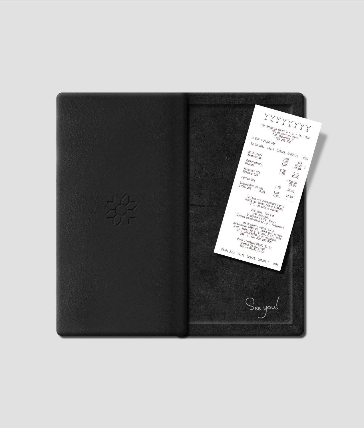
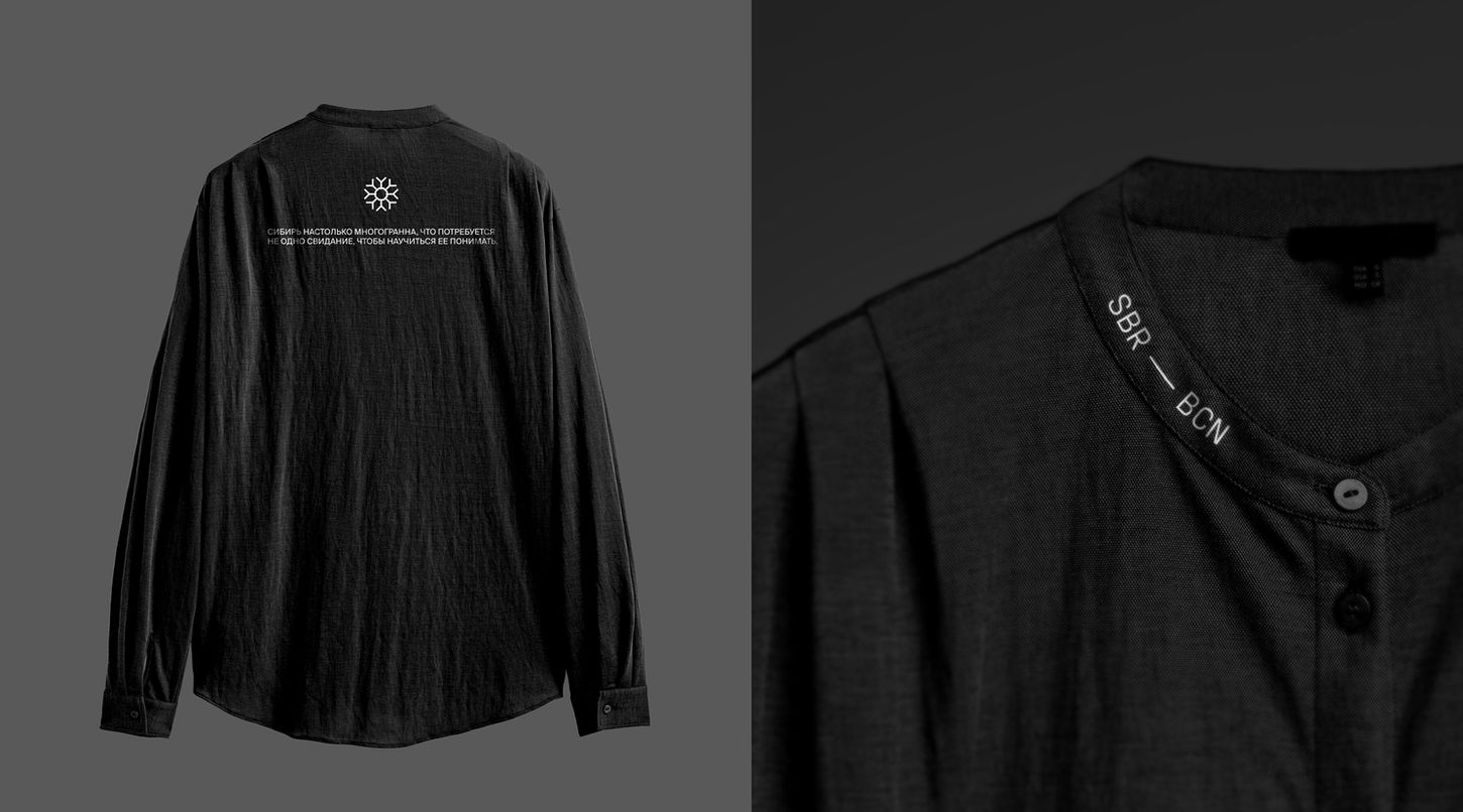
IDENTITY. The visual system is based on a minimalist snowflake, assembled from the silhouettes of cocktail glasses. This is not just a symbol, but a metaphor for the union of the cold of the North and the warmth of communication. The brand palette is built on the contrast of a black background and shimmering accents, while the dynamic illumination of the logo evokes the Northern Lights – the main symbol of Siberia's vibrant, ever-changing nature. The photography style is subdued, featuring natural textures, a subtle glow, and an atmosphere of mystery and depth. The travel theme is explored in every detail – from promotional flyers shaped like Barcelona-Siberia airline tickets to the label designs for craft liqueurs and beer. The staff wear minimalist, loose-fitting clothing, inspired by Siberian village style, creating a sense of naturalness and genuine hospitality.
RESULT. Siberiada is a journey to Siberia with respect and love. A modern, emotional, and atmospheric brand where authenticity meets aesthetics.


