
I believe that strategy and branding can change not only a company's image, but also its very way of thinking – making a business more conscious, stronger, and more connected to people. Alexander Magidson, founder of Brand Brothers
Packaging Form –
1/3 Packaging form isn't just a shell. It's part of the brand's language. Good packaging is memorable not just for its graphics and logo, but for its silhouette—just as we immediately recognize the brand from a shard of glass from a Coca-Cola bottle.
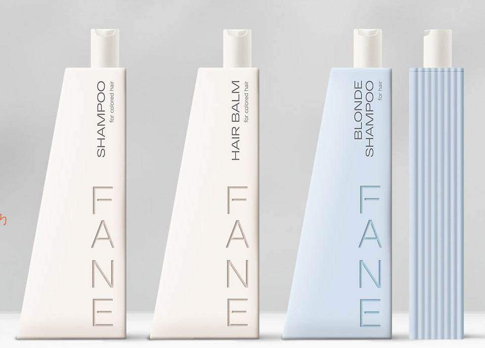
We design packaging so that you'll want to pick it up from the shelf—touch it, feel its texture, and feel its surface. Because through touch, customers begin to perceive the brand's character and understand their relationship with the product.


Our design process begins with sketches, which we propose based on the brand's concept, product features, and your category. We then create drawings and 3D models—at this stage, we begin to visualize how the packaging will look and function in real life.
We select materials, consult with mold manufacturers, and test stability, ergonomics, and aesthetics. The mold shouldn't just be cool for branding; it should function reliably in real life.

Packaging brings together a product's values, concept, and character. For us, packaging isn't just a household item, but an interactive experience where everything—from its shape to the sound of opening—reinforces the brand's message.
When idea, engineering, and aesthetics intersect, that magic is born that makes packaging "talk." The buyer doesn't analyze why they feel good holding it. They simply feel: this is "just what I need!"
.jpg)

Packaging design –
2/3 Packaging design is a language. Already at the design concept stage, we establish a hierarchy of messages: what the buyer will notice first, what they will remember, and what they will feel. We determine communication priorities – when do they prioritize a logo, a product photo, features, or value?
A) Especially with food products, purchasing decisions are made not by reason, but by emotion. A product's image triggers appetite, desire, and an immediate response—the brain sends a signal, "I want it!" We take this into account by aligning visual accents so that the packaging evokes the desired emotion.
B) Each package is part of a line. We establish a scaling logic: which elements will remain constant (color, composition, structure), and which will change with each SKU. This makes the line recognizable yet adaptable, ready for development and expansion.
C) There are also established symbols, colors, and visual techniques in each product category that buyers are accustomed to. We leverage our knowledge of these habits and apply familiar codes in our design to avoid disrupting the customer's choice process, making it faster and easier.
.jpg)
Good packaging design isn't just beautiful—it's also functional. It helps a brand communicate clearly, be visible, and be understood. It's a utilitarian tool that, with the right approach, can be transformed into art.
Every line, color, and font are brand messages that speak to people. We design not as decoration, but as a conversation in which the brand reveals itself, evokes emotion, and remains in the memory.

_edited.jpg)
.jpg)
.jpg)
3/3 Emotions are what transform packaging into a memorable story. People don't remember design details. They remember how they felt when they held the package in their hands. Therefore, packaging should speak to people not with words, but with feelings—warmth, trust, inspiration, or...anticipation.
-min.jpg)
.jpg)


When visual language, form, materials and tactile sensations come together, packaging ceases to be a shell and becomes part of personal experience.
She doesn't just sell - she creates an emotional connection that helps people buy again and again.